Announcing SimKube v1.0!


Ok, folks, this is the one you’ve all been waiting for1. I’m finally at a state where I can share some real2 results from SimKube. This is going to get split up over at least three posts, because there’s a lot of ground to cover, and I want to share as much context and background as I possibly can. Just like my previous series on SimKube, I will update this post with links to the upcoming posts as they’re available.
- Part 1 (this post) - Background and Motivation
- Part 2 - Running the Simulations
- Part 3 - Analysis and Following up
I’m pretty excited about this series of posts, to be honest: this is a big milestone for me, and I’ve been working pretty hard to get here over the last year. I’m also excited because this series marks the release of SimKube v1.0! There’s still a lot of work to do on SimKube before it’s where I want it to be, but I think SimKube is actually at a point where other people can use it and get useful information out, which is exhilarating3. So with that probably-over-the-top introduction, let’s dive in.
Autoscaling Kubernetes
If you’ve known me for any length of time, you’ll know that I’ve spent a lot of time in the autoscaling space. When I was at Yelp, I wrote Clusterman4 and I think that project was really successful in helping Yelp manage its cluster scaling for a long time. I don’t recommend that folks use Clusterman these days, because there are better options out there, but it will always have a soft spot in my heart.
Later on, I became a contributor and reviewer/approver for the Kubernetes Cluster Autoscaler, and even more recently than that, because a contributor to the Karpenter project. So all of that’s to say, I’ve been around this space for a little while (although there are certainly plenty of folks out there who have been doing this longer and better than I have).
In the last few years, there has been a bit of a friendly rivalry that’s developed between the two main cluster autoscaling engines, namely the Kubernetes Cluster Autoscaler (KCA) and Karpenter. While these two projects are trying to solve similar (but not exactly the same!) problems, the approaches that they take to solving this problem are very different. KCA is a much older, more mature project, and is well-supported across a host of different ecosystems and cloud providers. Unfortunately for that project, (at least in my opinion), because it was started so early in the Kubernetes project’s broader lifecycle, the design makes some assumptions about how users would want to autoscale their clusters that don’t hold up in reality5. Karpenter, on the other hand, is a much newer autoscaler developed by AWS that strives to use a more modern style of Kubernetes development using controllers. One of Karpenter’s goals is to solve some of the problems that users run into with KCA, particularly around scaling speed and node selection. Unfortunately for that project, it’s (currently) only available for AWS and Microsoft Azure customers6.
There’ve been a number of prominent KubeCon talks discussing the advantages of Karpenter over KCA, and so, given all of this context and my interest in the autoscaling domain, I thought it would be really interesting to use SimKube to do a head-to-head comparison of the two autoscalers.
Experiment setup
So how can we use SimKube to compare the Kubernetes Cluster Autoscaler and Karpenter? Well, first we need some input data (or a trace, in the SimKube vernacular) to test on. As I don’t currently have access to a large AWS compute cluster running real workloads, I decided to use DeathStarBench to generate some test data. For those who are unfamiliar, DeathStarBench (DSB) is a suite of “production-like” microservice-based applications that are used in a lot of academic literature for testing of distributed systems7. It includes a “social network” application, where users can create posts and follow other users in the system, a “media services”, where users can write reviews about movies that they’ve watched, and a “hotel reservations” service, which allows users to book rooms for a fake hotel chain. Each of these applications include helm charts so that they can be installed on Kubernetes, along with a set of scripts that you can use to generate load in different parts of the application.
For the purposes of this experiment, I wasn’t too concerned with the specific functionality that the application provided, so I just picked the social network application more-or-less at random. This application has 27 different services to handle things like writing posts, showing the user timeline, etc. In the setup for this experiment, I configured each service to run with CPU request of 1, and a memory request of 1GB8 9: I spun up a single-node Kubernetes cluster on an AWS c6i.8xlarge EC2 instance, which has 32 vCPUs and 64GB of RAM. Then I deployed social network to it, and let it settle into a “steady state” for about 10 minutes, before I started to induce load on the application.
Once the application had been running for a while, I used the scripts provided by DSB to induce load. The first step was to create a social graph; from there, I ran a second script to compose a whole bunch of posts; then I had a whole bunch of users read their home timelines; and then lastly, I had a whole bunch of users read timelines of other users. Here’s what it looked like:
The font is a bit small and hard to read on these graphs10, but what you can hopefully see is that we ran one pod per service (for a total of 27 pods) for the first ~ten minutes, and then we started scaling up. The first bump is when I created the social graph, and the second bump is when I started composing posts. But what happened after that? Why does it stay flat for the rest of the time? Well, here, take a look at this graph:
If you’ll recall, I was running this on a single-node Kubernetes cluster with 32 vCPUs, and each pod requests a single vCPU, which means that once 32 pods got scheduled, nothing more could be done. If this had been an actual social network, this would have been a major outage! Fortunately, I do not work at an actual major social network.
First SimKube test: is it a simulator?
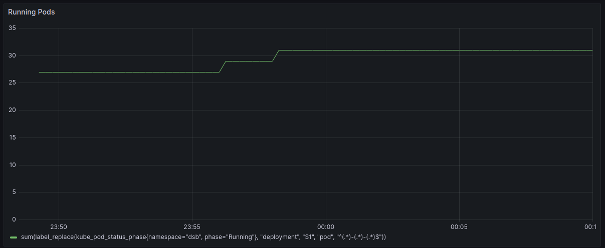
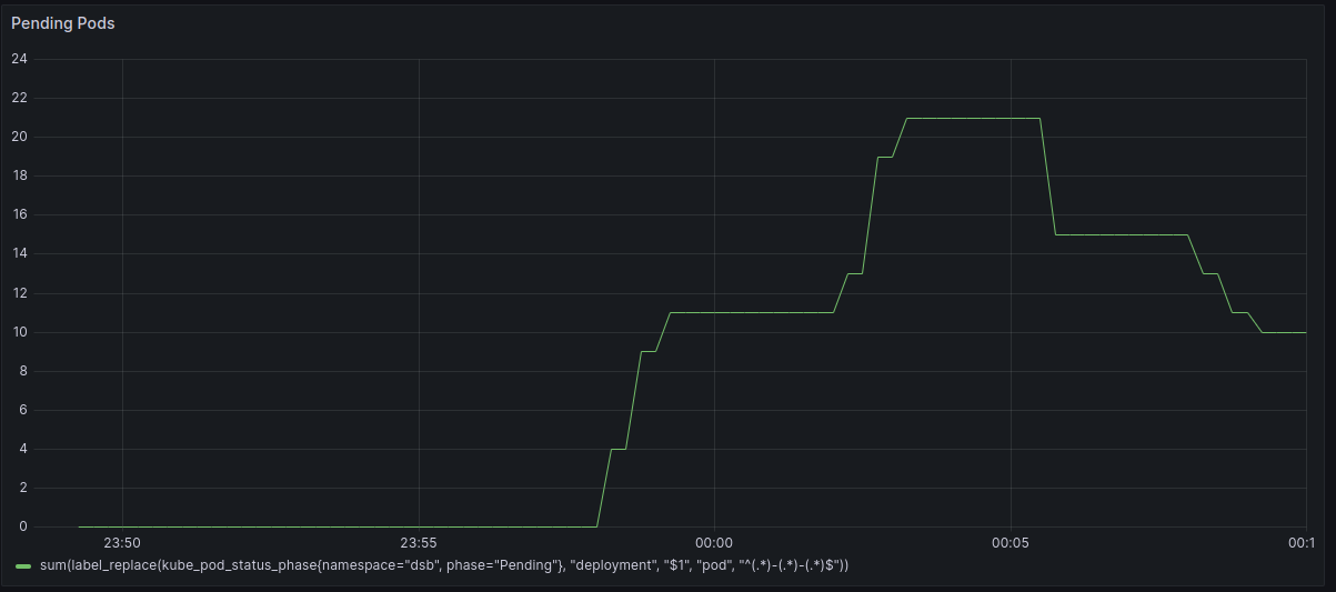
Once I finished the experimental setup, I captured a trace of all the deployments in the system. Before I even got to the autoscaling comparison, there was an important question I needed to answer: is SimKube a simulator? In other words, if I create a simulated environment and replay the trace of the above timeline, the cluster should behave equivalently. I’m happy to say here that the answer seems to be yes! Here are graphs of the pending and running pods for the simulation environment:
To generate these graphs, I replayed the trace I captured 10 times, and I used Prometheus and prom2parquet to save all of the generated metrics from the simulation into parquet files in S3. There are a few quirks in the above data: you can see some odd intermittent jumps and spikes; most of these are, I believe, artifacts of the metrics collection pipeline. You can also see a brief spike of “pending pods” near the beginning of the simulations, as well as a dip in the pending pods at around thirteen minutes in: these differences can be attributed to the fact that my simulation Prometheus was scraping data once per second11, whereas in the original (real) version, I was only scraping once every 30 seconds, so some of these smaller changes are masked in the Grafana charts. Aside from these small differences, at least from a visual inspection, it looks like the simulator is doing exactly the same thing as the “real thing”12.
“But wait,” I hear you say. “Didn’t you say you ran this 10 times? I only see one line above, with a couple weird multi-colored bumps in it!” But, actually, you are looking at 10 lines in the above graphs—they’re just all right on top of each other! I was actually expecting slightly more variability in the results than actually occurred. I was pleasantly surprised at how close each of the individual simulation runs were to each other.
However, just to demonstrate that these are actually all distinct runs, here is the same set of 10 simulations, showing which pods actually get scheduled (grouped by service). This is where you can start seeing some variability. The pods that get scheduled are essentially random, since it depends on “which pod kube-scheduler sees first”, and this is going to be highly susceptible to tiny timing changes. Essentially, if the deployment controller for service A takes a hundredth of a second longer to create a pod than service B in one of the simulations, then the order of A and B’s pods in the scheduler queue might get swapped and you’ll see different running pods in each simulation13.
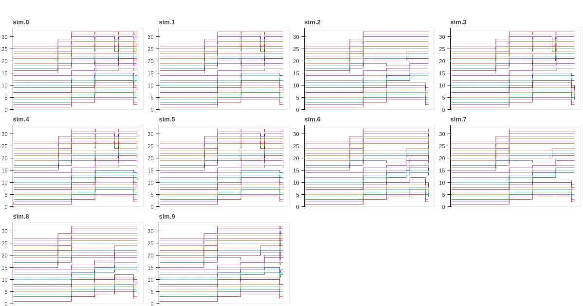
I know the above plots are tiny, but I’m not interested in the numbers themselves, but in the differences, which are
still visible even at a small resolution: for instance, it’s quite clear that sim.2 is running a different set of pods
about two-thirds of the way through the simulation than some of the other simulations are. For the purposes of this
experiment, however, this level of variability is fine. I’m interested in knowing how the autoscalers perform, not
exactly which pods get scheduled when. But learning about that will have to wait until the next post!
Wrapping up
I know this post was just a bunch of setup and I ended you on a cliffhanger. Sorry about that. I hope you still found it interesting! If you would like to take a look at the data I used to write this post, I’ve made it all publicly available online. This includes the trace that I captured to run these experiments, as well as all the raw Parquet data and the Jupyter notebooks that I did the analysis in. I’d love to hear if you’re able to run or replicate these results, and especially if you get different results or have other interesting insights!
I’ll be sharing a bunch more about SimKube in a bunch of different venues over the next few months, and there’s still a lot of work to be done, so if any of this is interesting to you, I’d love to have your help! Please let me know.
Thanks for reading,
~drmorr
-
You have been waiting for it, right? Don’t tell me if you haven’t, my self-esteem is fragile. ↩
-
For some definition of “real”. ↩
-
Interested in using SimKube to analyze your Kubernetes clusters? Get in touch! I’d love to hear more about what you’re working on, and the problems you’re trying to solve. ↩
-
A colleague likes to refer to Clusterman as “the world’s only Mesos + Kubernetes autoscaler”, which very well may be true! ↩
-
The biggest example of such an assumption being that Kubernetes clusters generally contain a single (or small number) of types of compute hardware, which definitely isn’t true in practice! ↩
-
And there are some mutterings that GCP may be actively eschewing Karpenter support/interoperability, though I have no idea how true or not those mutterings are. ↩
-
In Kubernetes, you can set both “requests” and “limits” – requests act as a guaranteed minimum amount of resources that your application will receive, and consequently is what is used during pod scheduling to determine if your pod “fits” on a machine. Limits are instead an enforced maximum amount of resources that your application is allowed to use; in a real application, you should always set memory requests equal to memory limits. There is some debate about whether you should use CPU limits at all. ↩
-
Foreshadowing: I will regret this decision later. ↩
-
You will see much better/nicer looking graphs towards the end of this post and in later posts, but when I was running this part of the experiment I hadn’t invested much time in my analytics pipeline yet, so you just get these crappy Grafana screenshots. ↩
-
Wanna know how to overwhelm your metrics pipeline with data? This is how. ↩
-
If you’ve been paying particularly close attention to the graphs, you’ll notice that this statement is actually a lie. In the Grafana dashboard from the “real” application, running pods only scales up to 31, and pending pods scales up to 21 at its peak, for a total of 52 pending or running pods at the maximum. In the simulated version, running pods scales up to 32, and pending pods only scales up to 20 at its peak! Still the same total number of pods, but what’s going on here? Well, early in my cluster configuration, I had a test pod that I deployed that requested 1 vCPU, which was present in the “real” application; later, I updated my stuff and no longer deployed that test pod by default, so in the simulated version there was one extra “slot” for a pod to run in before things went into pending state. Unfortunately I didn’t keep any of the raw metrics data from the “real” run, so I don’t have a way to prove that; you’ll just have to take my word for it. I’ve gotten much better at this as time goes on, as I’m sure you’ll see particularly in the next couple posts. ↩
-
This fact is both one of the strengths and weaknesses of the SimKube approach to simulation: this type of variability is essentially impossible to control for in SimKube, which good because it more closely resembles things that might happen in the real environment. But, if you actually need to control the details of your simulation down to the ordering of pods in the scheduler queue, then you’re going to need to use an entirely different (and probably harder to build) architecture. ↩